Difference between revisions of "CTF 2Fort (Evolution)"
(Cleaned up article, removed unnecessary nailgun trivia) |
m |
||
| Line 22: | Line 22: | ||
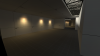
Hl2 2018-01-13 13-45-05.png|Intel area | Hl2 2018-01-13 13-45-05.png|Intel area | ||
Hl2 2018-01-13 13-44-33.png|Spawn dropdown | Hl2 2018-01-13 13-44-33.png|Spawn dropdown | ||
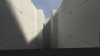
| − | Hl2 2018-01-13 13-44-39.png| | + | Hl2 2018-01-13 13-44-39.png|Courtyard pit |
</gallery> | </gallery> | ||
{{Clear}} | {{Clear}} | ||
Revision as of 23:23, 11 July 2023
The visual gem of Team Fortress 2, ctf_2fort has easily had the most released of it, beta-wise, compared to any other map present, dating to as early as 2005 before the game even had a trailer released. This is a look into Moby Francke's style and how the map evolved.
Contents
- 1 Origins:
- 2 Version 0: devtest.bsp
- 3 Version 1: Art Pass Version 1
- 4 Version 3: Art Pass Version 2
- 5 Version 4:Art Pass Version 3
- 6 Version 5: Trailer 1
- 7 Version 6: Trailer 2
- 8 Version 6: Early IR
- 9 Version 7: Postal III Leak (June 2007)
- 10 Version 8: IR Presentation
- 11 Version 9: Retail
- 12 References
Origins:
At his 2012 and 2018 presentation, Moby Francke showed off in his slideshow an many early versions of 2Fort before they had finalized an artpass, with early player models alongside from tf2's 2005 period of development. With some more recent filmed presentations and the release of one of his powerpoints, more shots of the fort have become available.
Version 0: devtest.bsp

An extremely early version of 2Fort that was present in SFM's files, presumably by accident. Most of the map uses development textures, with both sides being mirrored. Fence models from Half-Life 2 (and on occasion, textures from Team Fortress Classic) are frequent, being used as placeholders. The map has many similarities to its TFC counterpart not shared in the final version, such as seperate exit/entrance spawn doors, and the platform going above the pit, rather than around. There are multiple references to some early TF2 entities:
info_player_tfteamspawnfunc_tf_capture_zonetf_capture_flag
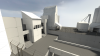
Screenshots
Bridge
Front facade
Spawn room
Spawn area
Intel room
Below bridge
Stairway to intel
Intel spawnroom
"Entrance" section
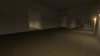
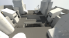
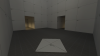
Intel area
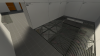
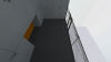
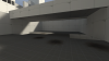
Spawn dropdown
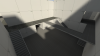
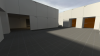
Courtyard pit


Version 1: Art Pass Version 1

This version is a light artpass with color coding for both bases, what's interesting to note here is the orange and red color scheme used for both bases. It's likely that the artpasser was testing out aesthetics for the RED team.
Screenshots


Version 3: Art Pass Version 2

Similar to version 1, However it has more actual texture work that we would see in the final map and less of the flat colors used to represent the 2 teams, and the early player models make a their first appearance outside of a early lineup. Curiously, there seem to be signs placed in front of each of the two buildings saying what side they are. Since there is some texturing, it is clearly after version 1, but it lacks the semi-complete texturing of version 3.
Screenshots


Version 4:Art Pass Version 3

Within the files released by Valve to the press, there were two pieces of concept art for 2Fort. They are very lightly painted-overs of the previous version based on devtest, with some vague shapes added and the overall color balance tweaked[1]. However, the near-omnipresent aliasing on a majority of the shapes gives away that this is a decent representation what the map looked like by the time this art was made.
In comparison to version 2, there is much more texturing, with the forts having their respective color. The sewer area has yet to get any water within it, but is more detailed than before. Since there is a large opaque area painted over on the front of the BLU Fort, it appears that the team indicator sign had not been removed from it during this period. Overall, the map maintains a fairly simplistic style, with lush colors and fairly little detail.
Trivia
- The signs near the sewers are mismatched, likely an oversight on Valve's part when making this paintover.
Art


Version 5: Trailer 1
This is where things began to take shape into the version of the map that shipped with the game. That being said, much of the level is still incomplete and far out from its final rendition. Both intel rooms have been given their Spytech design, albeit with some difference from the final game. The BLU side has cream-coloured tiles as opposed to the later navy tiles it would use. While the RED side has a saturated red tiled floor as opposed to its later desaturated maroon version. The basement resupply room on RED side appears to use the Spytech aesthetic as opposed to a unique locker room design, similarly to the cp_well spawn rooms. BLU's battlements are unfinished, and have been mostly omitted from the trailer, save for some small scenes where it can be seen that they are using temporary blue concrete textures. The intelligence room uses a different railing model overlooking the computer room. Finally, the wall at the bottom of RED's barn staircase has the old TFC RED logo on it.
Screenshots


Version 6: Trailer 2

This is how 2Fort appeared in the second trailer for the game, as well as surrounding media. Nearly final, this version has a largely identical appearance to the final aside from a few noticeable differences: The bridge has yet to have a roof added, there are still signs stating the team name above the sewers, and signs next to the intel room respawn rooms. Some logos and textures also still differ, such as the one above the blue building, or the logo in the RED Fort's basement. Most notably, the majority of BLU team's fort has been finalized from it's trailer 1 predecessor.
Screenshots


Version 6: Early IR
Screenshots


Version 7: Postal III Leak (June 2007)
Version 8: IR Presentation
Version 9: Retail
Screenshots
References
- ↑ On the picture showing the RED Fort, a small section at the bottom was overlooked, which still has the original palette.